Datos personales y laborales
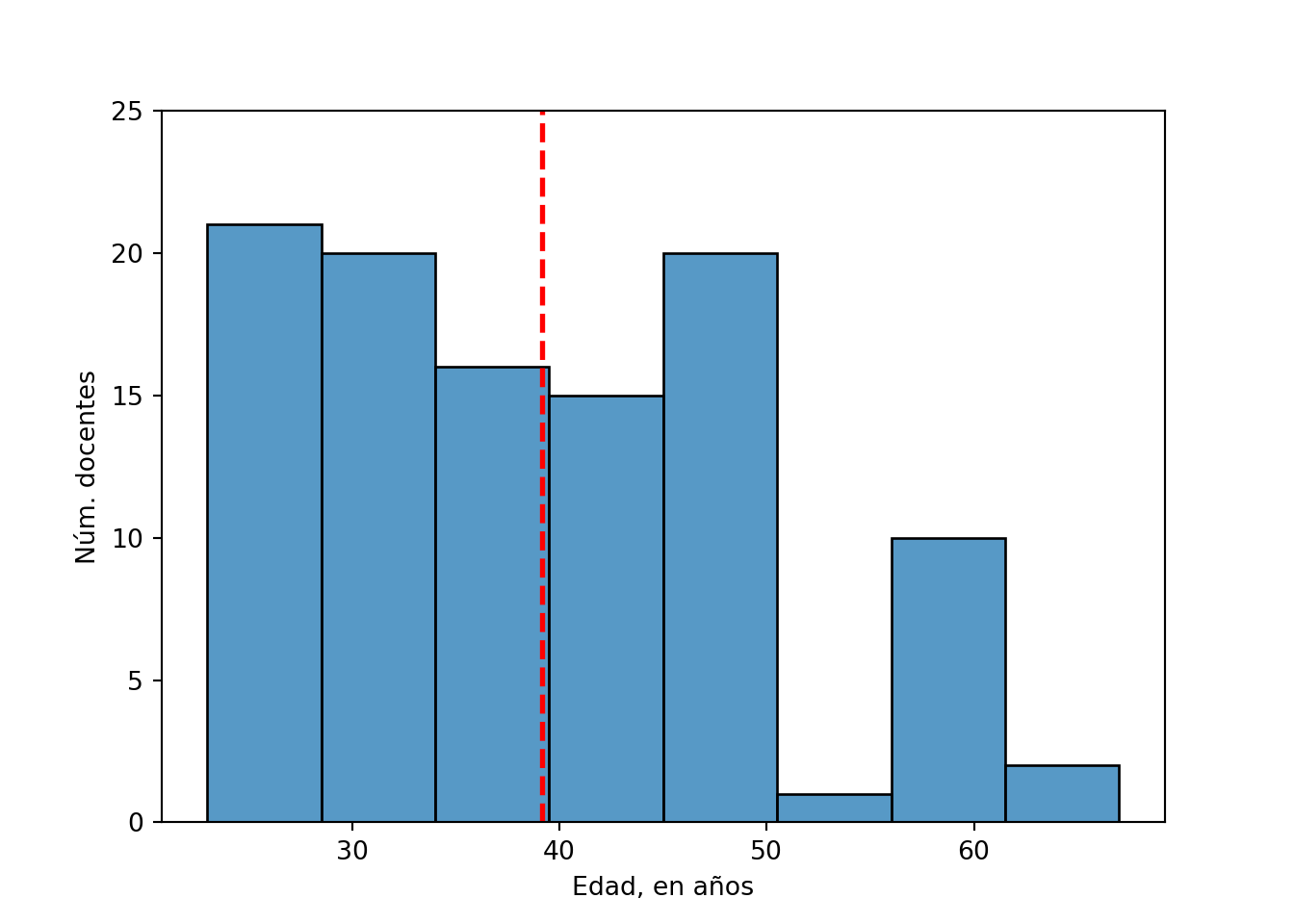
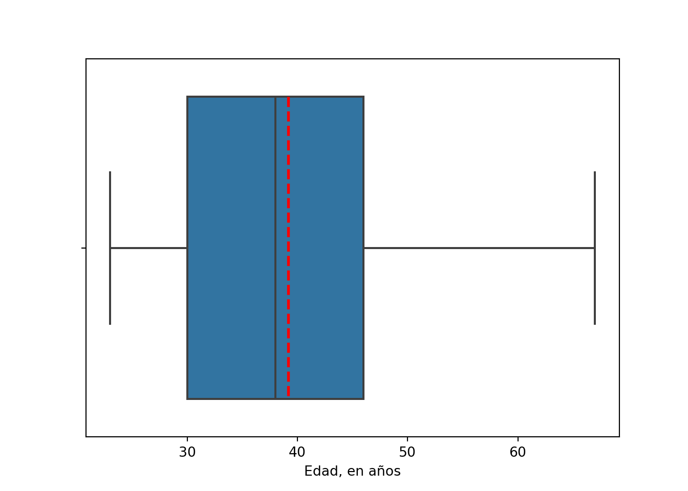
## Edad
df['edad'].describe().astype(int)
## count    105
## mean      39
## std       10
## min       23
## 25%       30
## 50%       38
## 75%       46
## max       67
## Name: edad, dtype: int64
sns.histplot(x='edad', data=df)
plt.ylabel('Núm. docentes')
plt.xlabel('Edad, en años')
plt.ylim(0,25)
## (0.0, 25.0)
plt.axvline(df['edad'].mean(), color='red', linestyle='dashed', linewidth=2)
plt.show()
sns.boxplot(x='edad', data=df, showmeans=True, meanline=True, meanprops={'color':'red','linewidth':2})
plt.xlabel('Edad, en años')
plt.show()
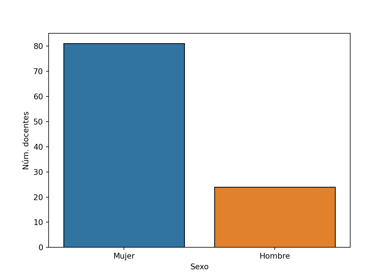
## Sexo
df['sexo'].value_counts()
## Mujer     81
## Hombre    24
## Name: sexo, dtype: int64
df['sexo'].value_counts(normalize=True).round(2)
## Mujer     0.77
## Hombre    0.23
## Name: sexo, dtype: float64
sns.countplot(x='sexo', data=df, edgecolor='black')
plt.ylabel('Núm. docentes')
plt.xlabel('Sexo')
plt.show()
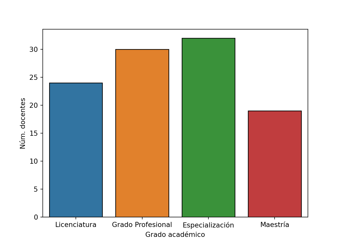
## Grado académico
df['grado'].value_counts(sort=False)
## Licenciatura         24
## Grado Profesional    30
## Especialización      32
## Maestría             19
## Name: grado, dtype: int64
df['grado'].value_counts(sort=False, normalize=True).round(2)
## Licenciatura         0.23
## Grado Profesional    0.29
## Especialización      0.30
## Maestría             0.18
## Name: grado, dtype: float64
sns.countplot(x='grado', data=df, edgecolor='black')
plt.xlabel('Grado académico')
plt.ylabel('Núm. docentes')
plt.show()
## Facultad
df['facultad'].value_counts()
## Ciencias de la Salud    74
## Medicina                31
## Name: facultad, dtype: int64
df['facultad'].value_counts(normalize=True).round(2)
## Ciencias de la Salud    0.7
## Medicina                0.3
## Name: facultad, dtype: float64
sns.countplot(x='facultad', data=df, edgecolor='black')
plt.xlabel('Unidad académica')
plt.ylabel('Núm. docentes')
plt.show()

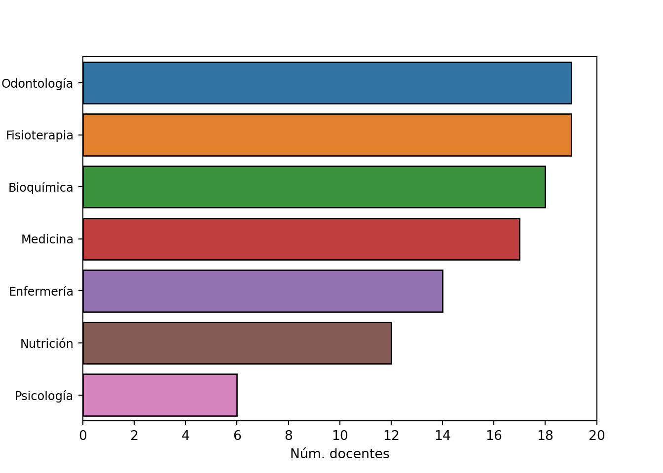
## Carrera
df['carrera'].value_counts()
## Odontología     19
## Fisioterapia    19
## Bioquímica      18
## Medicina        17
## Enfermería      14
## Nutrición       12
## Psicología       6
## Name: carrera, dtype: int64
df['carrera'].value_counts(normalize=True).round(2)
## Odontología     0.18
## Fisioterapia    0.18
## Bioquímica      0.17
## Medicina        0.16
## Enfermería      0.13
## Nutrición       0.11
## Psicología      0.06
## Name: carrera, dtype: float64
sns.countplot(y='carrera', data=df, order=df['carrera'].value_counts().index, edgecolor='black')
plt.ylabel('Carrera')
plt.xlabel('Núm. docentes')
plt.yticks(size=9)
## (array([0, 1, 2, 3, 4, 5, 6]), [Text(0, 0, 'Odontología'), Text(0, 1, 'Fisioterapia'), Text(0, 2, 'Bioquímica'), Text(0, 3, 'Medicina'), Text(0, 4, 'Enfermería'), Text(0, 5, 'Nutrición'), Text(0, 6, 'Psicología')])
plt.xticks(np.arange(0, 21, step=2))
## ([<matplotlib.axis.XTick object at 0x15f633430>, <matplotlib.axis.XTick object at 0x15f633400>, <matplotlib.axis.XTick object at 0x15f629f40>, <matplotlib.axis.XTick object at 0x15f6703a0>, <matplotlib.axis.XTick object at 0x15f6707f0>, <matplotlib.axis.XTick object at 0x15f670d00>, <matplotlib.axis.XTick object at 0x15f676250>, <matplotlib.axis.XTick object at 0x15f676760>, <matplotlib.axis.XTick object at 0x15f676c70>, <matplotlib.axis.XTick object at 0x15f67d1c0>, <matplotlib.axis.XTick object at 0x15f6769a0>], [Text(0, 0, ''), Text(0, 0, ''), Text(0, 0, ''), Text(0, 0, ''), Text(0, 0, ''), Text(0, 0, ''), Text(0, 0, ''), Text(0, 0, ''), Text(0, 0, ''), Text(0, 0, ''), Text(0, 0, '')])
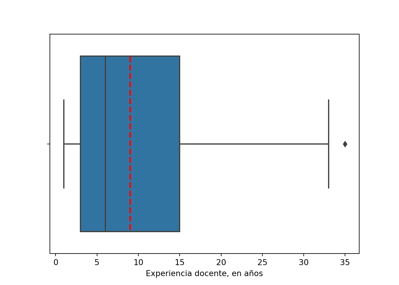
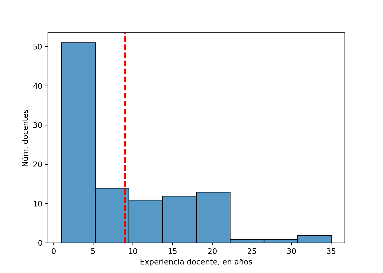
## Experiencia docente
df['experiencia'].describe().astype(int)
## count    105
## mean       8
## std        7
## min        1
## 25%        3
## 50%        6
## 75%       15
## max       35
## Name: experiencia, dtype: int64
sns.histplot(x='experiencia', data=df)
plt.xlabel('Experiencia docente, en años')
plt.ylabel('Núm. docentes')
plt.axvline(df['experiencia'].mean(), color='red', linestyle='dashed', linewidth=2)
plt.show()
sns.boxplot(x='experiencia', data=df, showmeans=True, meanline=True, meanprops={'color':'red','linewidth':2})
plt.xlabel('Experiencia docente, en años')
plt.show()